Felitaur Site
Offerings
|
|
Web Page Design Issues
Advice books on how to
design your web pages properly are so numerous there is no point trying to
count them. Despite this overwhelming abundance of often contradictary
advice, there are some basic, common sense things you can keep in mind
when designing your site:
- What is the purpose of your website? (If you just say "to make money"
then you're missing the point.)
- What is the main content of your site that you wish your
customers/viewers to be able to access?
- Who is your target audience?
- What features do you like/dislike about some sites?
- Could your parents/grandparents/aunts/uncles figure out your
site?
- What is the purpose of your site? If it is to replace your technical
support department, then technical support should be the easiest thing to
find on your site.
- What do you offer to your customers/viewers? What do they get out of
your site?
- Do you make it easy for folks to contact you? Is there at least a
"mailto:" on each page?
- If you are using the newest, most bleeding edge webpage tags and
technologies, how many of your viewers/customers will not be able to view
your site?
- Do you REALLY need that neat sound file, full length movie or 10
minute flash intro? What does it add to your site in the way of
functionality and usability?
There are also several
things that you can pretty well expect to NOT go over well on your site if
you use them.
- Long pages (have to hit "page down" more then 2-3 times)
- Big pages that take more than 20-30 seconds to download, or have a
large number of oversized graphics, sound files, movie files, flash
animations etc. (remember, a lot of folks still use 56k modesm)
- <BLINK> and <Marquee> tags. The excessive motion is very
distracting and makes your page hard to read
- Even WORSE is the use of banner ads, especially ones that do
information tracking, have java applets in them, etc. Folks don't like
banner ads, and rarely click on them.
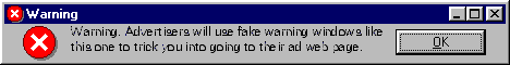
- And the most evil of banner ads try to trick you into thinking it's a
message from MS Windows, where you foolishly try to click the "x" to close
it and it instead takes you to the ad site.
(Try Clicking the x, or anywhere for that matter)
- Links that say "This page is best viewed with MY favorite browser (IE,
Netscape, Opera, Mozilla, etc.) and if you want to view it you had better
install MY favorite browser. (This IS what you are saying when you put
those "best viewed with" tags on your page.)
- Excessive use of menus, making the page way too cluttered.
- Unnecessary Java applets that add time and crashability to your
page.
Related Links
"What Not to Do (and to do)
- Web Pages That Suck
A
site that shows you a lot of what not to do. Go to the "original sucky
pages" along with the "daily sucker" for some interesting commentary and
examples. His rant on "Don't confuse Web Design with Sex" is also
enlightening (and G rated, it isn't about sex)
-
Survey on how fast your web page should take to load!
- Are
Users Stupid?"
A serious look at why usability is important, and
that users are not stupid. A very good article for people overly
enamored of complex, fancy bell and whistle web site and don't want
to believe that it is not the best way to go.
- The Cluetrain Manifesto
This site is somewhat extreme in it's views (IMHO), but it does point out
that the internet is a bit different that a TV ad. While you may not agree
with what they say, realize that some of these people are potential
customers/viewers, so it can't hurt to see what they have to say.
- Font
Abuse
The name says it all. DO check out the source code though,
it's
scary.
- AlertBox: Jakob Nielsen's
Column on Web Usability (The next two links are from there also)
- Flash 99%
Bad
Another good article that explains why content is important,
and how things like Flash can make a site LESS usable, usually in direct
opposition to the "coolness factor" it adds to your site.
- Why Advertising
Doesn't Work on the Web
- Why Frames Suck Most
of the time
- How
to build lame web sites
A rather tongue in cheek article, but some
good points.
- How to make an
annoying web page!
It uses an annoying "cover page" but once you enter the site it gives a
lot of advice on nearly every aspect of HTML you might use. Again, take
with a grain of salt, but it may give you ideas.
- Making a
WWW Flop
Very sarcastic, though some good points. Has 4 good links to "things to
do" sites.
- Top Ten Mistakes in
Web Design
- Top Ten Ways to tell if you
have a sucky web page
A tongue in cheek site that makes some good points. I kind of like the
"sucky to savy" link he has for improving your web pages. I'll admit, I'm
trying not to take his comment about "pictures of your pets" too
personally. (Hey, I LIKE putting pictures of my
ferrets up on the site. ;)
-
Don't make me think!
This is a link to the Amazon.com book page that has the "Don't Make me
think! A common sense approach to web Usability" book review on it. I'm
not endorsing the book, or recommending you buy it, but read the comments
at the bottom. It just might make you think. ;)

A site that promotes the idea that you CAN make good web sites that can be
viewed by ANY browser. Check it out.
|
|